A statistical process control chart shows how a process varies over time. Like a run chart, it plots data points in order. The main difference is that it includes upper and lower process control limits, which more clearly distinguish common cause variation from special cause (unusual) variation.
Use a control chart to:
- identify unusual patterns in the data, which are unlikely to have occurred due to chance
- identify safety signals for investigation
- decide whether an improvement approach is working
- understand whether a change is sustainable.
Common cause variation
Common cause variation is routine variation that is inherent in any process. It affects every person, every patient and every outcome. A control chart that shows only common cause variation indicates a stable process that is performing as well as the current system allows.
If the team wants better results, the system itself has to change. Test improvements with Plan-Do-Study-Act cycles, then re-establish new control limits.
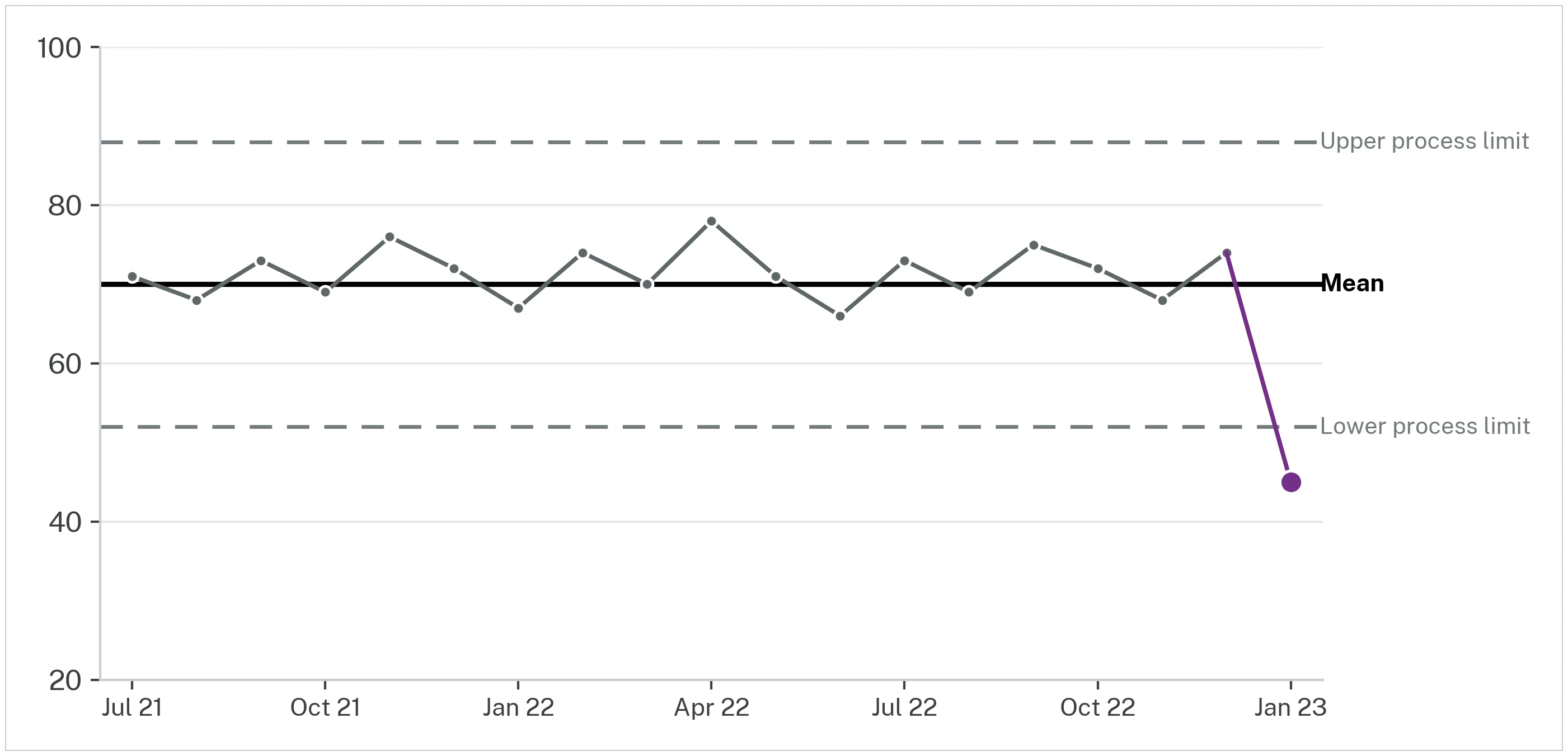
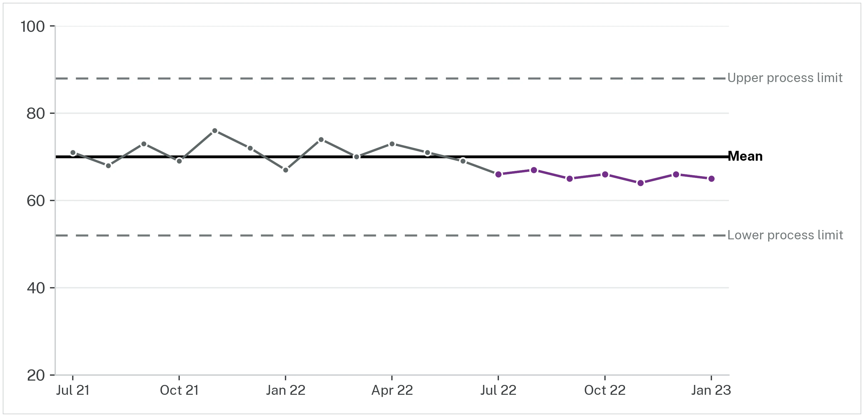
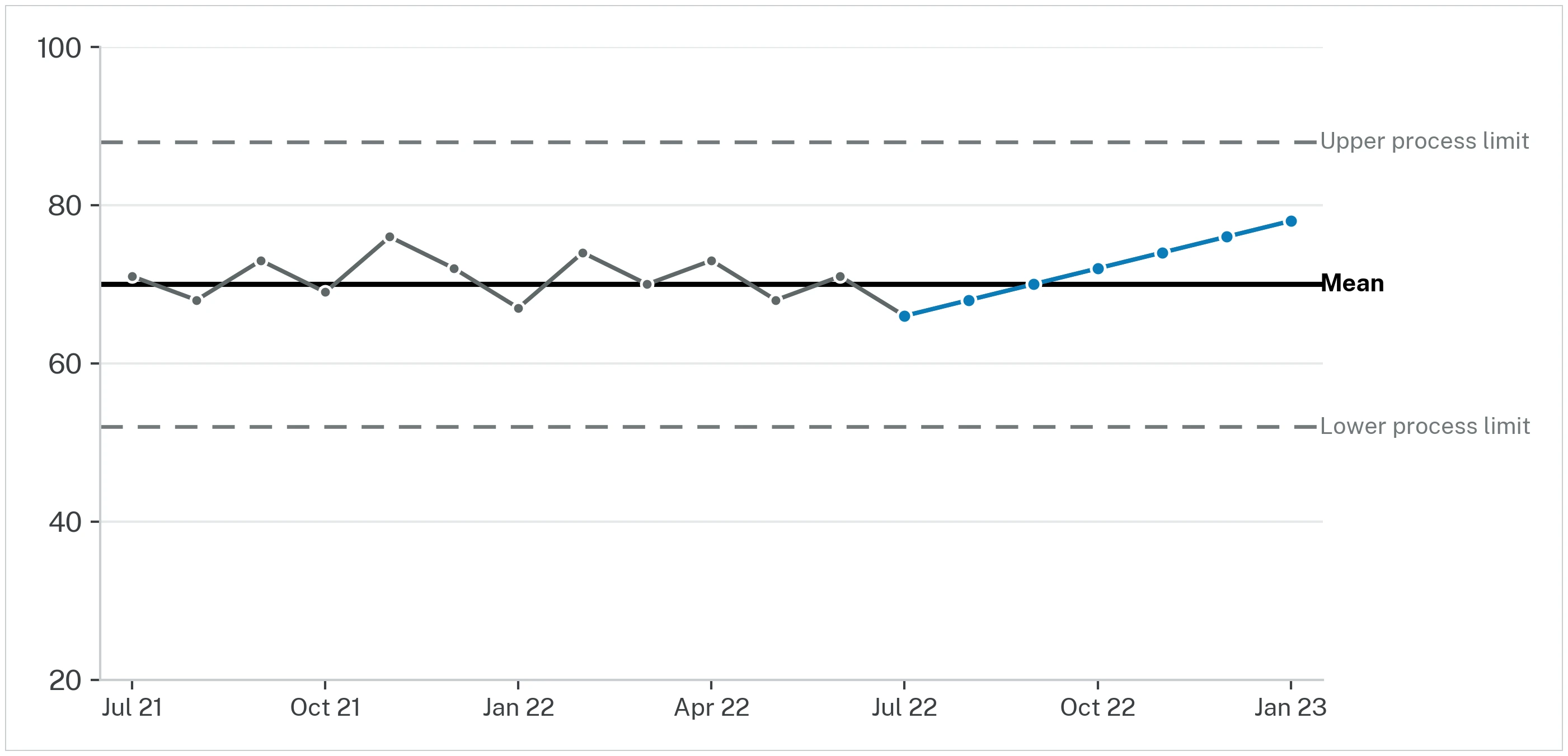
Special cause variation
Special causes are unlikely to be due to chance, and provide opportunities for learning and improvement as well as identifying potential safety issues in a timely manner. We recommend the ‘Making Data Count’ control chart rules for identifying special cause variation:
- a single data point outside the process control limits
- a shift of 7 points above or below the mean line
- a run of 5 data points in ascending or descending order (trend).
When special cause appears:
- if improvement, find out why and look for ways to make the change permanent or
- if concerning, investigate potential causes and act to prevent it happening again.
See Making Data Count for more information on statistical process control charts.