A Pareto chart ranks problems by their significance. It then uses the Pareto Principle (80/20 rule) to identify where action should be focused. Use a pareto chart to focus your team on the small number of factors that will make the biggest difference.
The 80/20 rule
The 80/20 rule (the Pareto Principle, or the law of the vital few and trivial many) states that for many events, around 80% of the effect comes from 20% of the causes.
Common examples include:
- 80% of complaints come from 20% of customers
- 80% of sales come from 20% of clients
- 80% of computer crashes come from 20% of bugs.
How to read a pareto chart
Each bar represents a category. Bars are arranged from highest to lowest and represent the ‘size’ of an issue (such as number of issues, cost, frequency, time spent etc.) This tells us which situations or issues are most significant.
Pareto chart example
A team is asked to identify issues that impact their workload. The issues are arranged in categories with the most issues to the fewest issues.
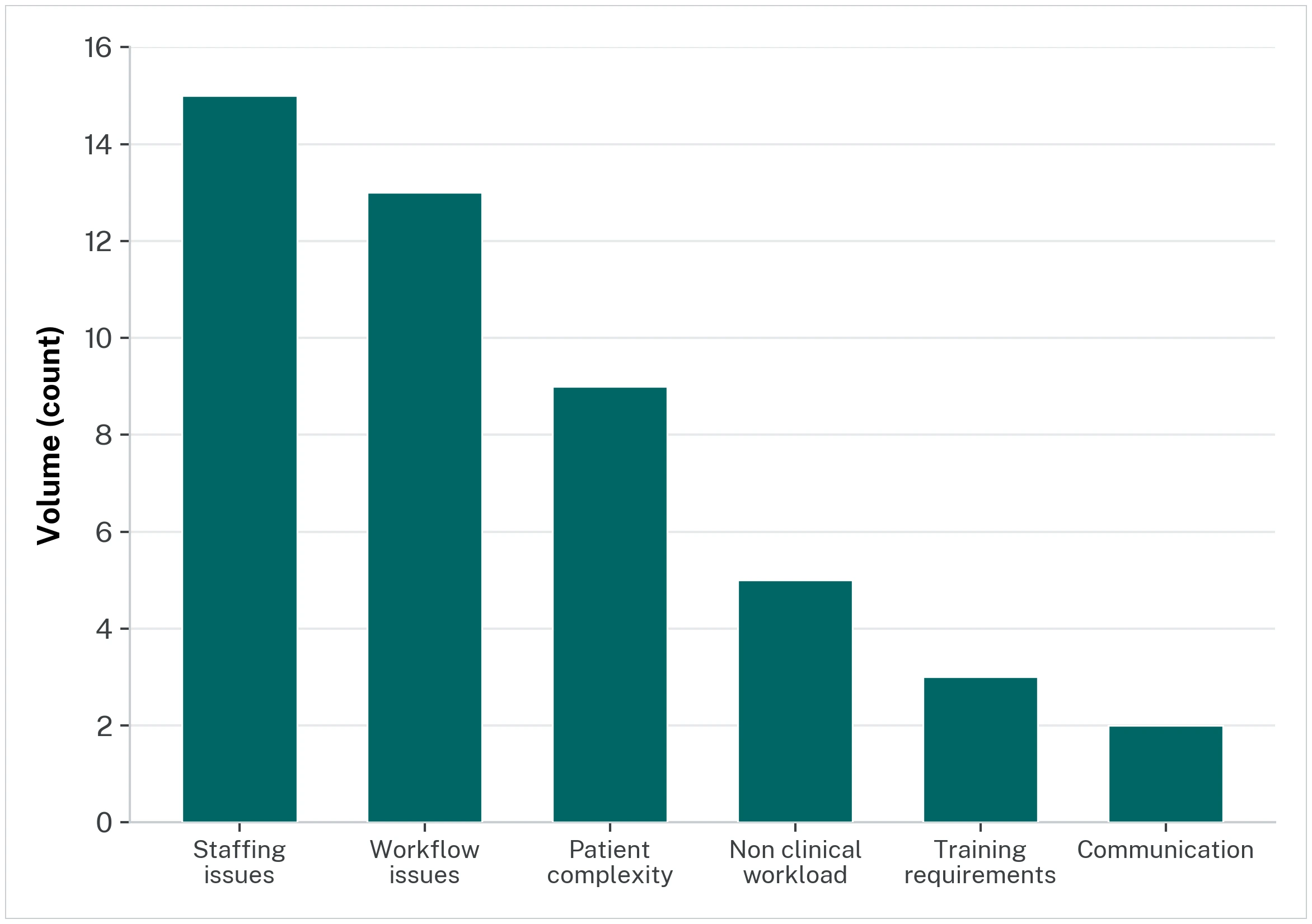
They reported a total of 47 issues in total.
A curved line is added to show the cumulative percentage of the issues. This line shows the proportion of each category as a percentage of all the issues).
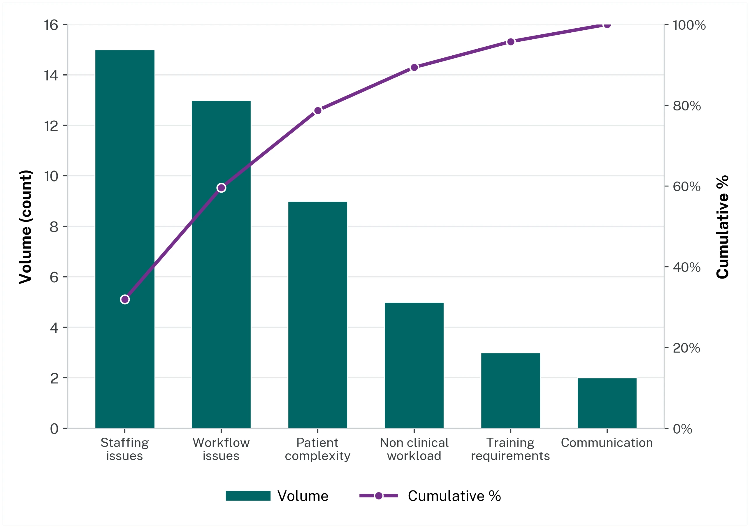
We can see that staffing issues account for the highest volume of issues (green column - left side axis - n=15), and represents 32% of all of the issues together (purple line - right side of axis).
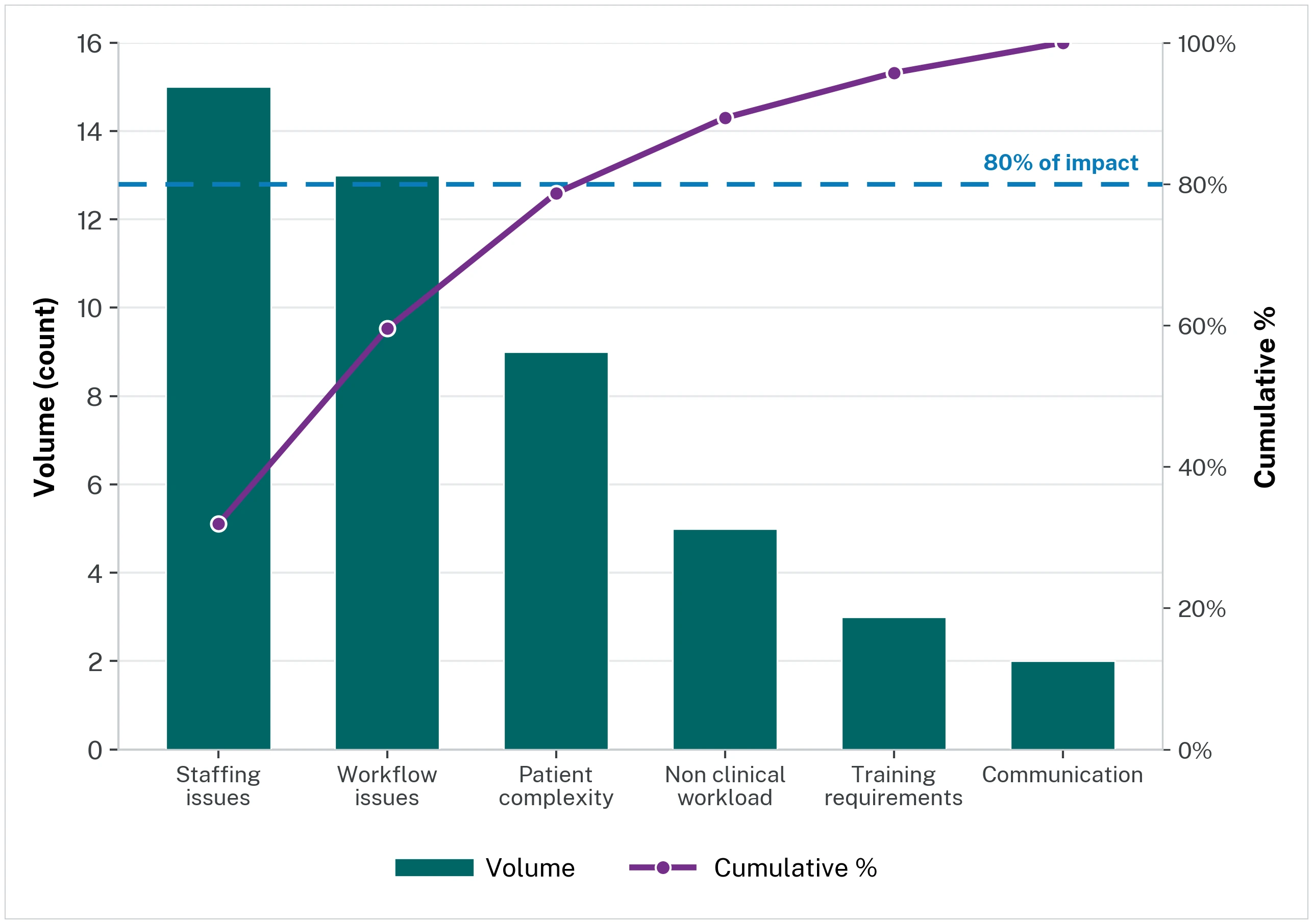
A horizontal cut-off line at 80% shows you where that cumulative total reaches the Pareto Principle of 80/20. At this point 80% of the issues have been included in the categories up to that point. The easiest way to interpret this is to imagine a square extending from where the cumulative total (purple line) meets the 80% line (blue line) back towards the Y axis.
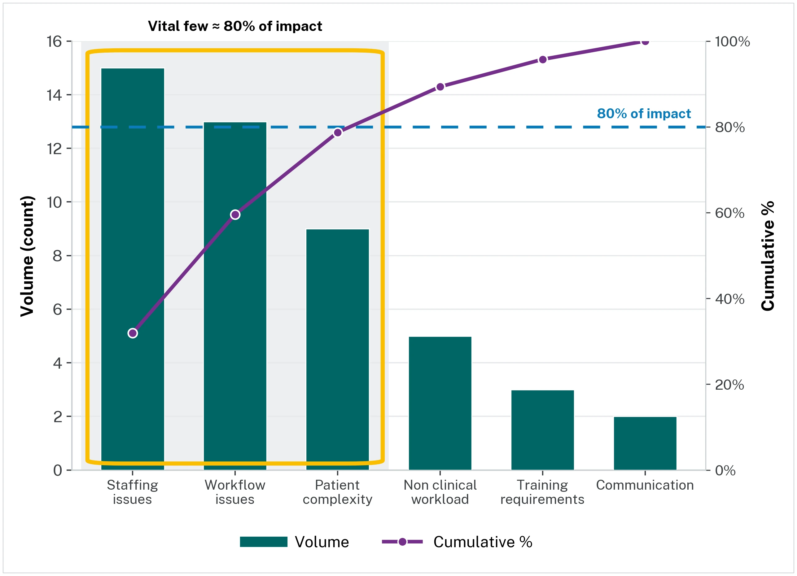
This indicates marks the vital few causes that drive most of the effect, and these are the categories where you should focus your actions.
Video tutorials
More about pareto charts (Institute for Healthcare Improvement)