A run chart shows how a measurement varies over time. It helps you to see whether things are improving, getting worse, or staying the same.
Use a run chart to:
- see how an existing process is working
- check is a change (like an improvement) is making a difference
- guide the next step in a Plan-Do-Study-Act (PDSA) cycle.
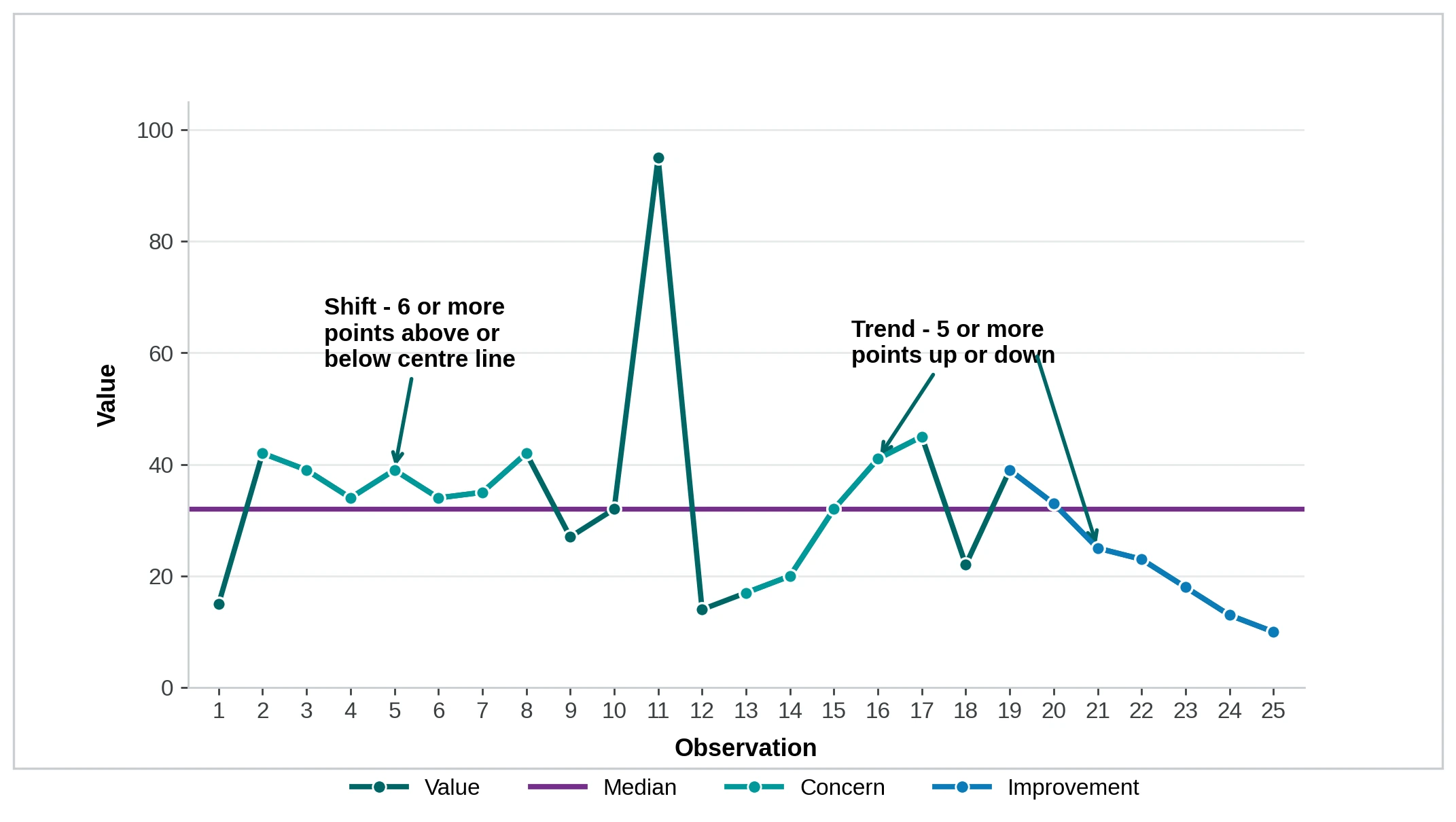
Annotate the chart to show where you made a change and what happened next. This turns a graph into a story your team can act on.
Download run chart template (XLSX 2.7 MB)
What goes on a run chart
You can plot two types of data:
- Continuous (variables) data: values on a continuous scale, like length of stay in days, total attendance or wait times in minutes.
- Attribute (discrete) data: counts that fit into categories, like infected or not, late or on time, present or absent.
Add a horizontal line for the centre of your data. Use the median until you have more than 20 data points, then switch to the mean (average).
You can also add a stretch goal as a second horizontal line. This shows the direction and target your team is aiming for.
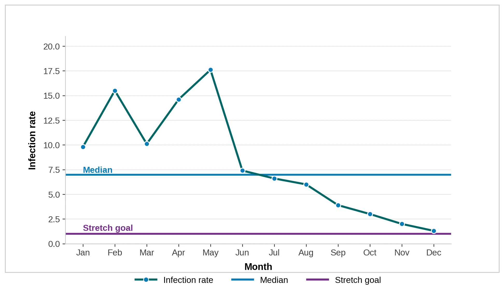
Definition of Rate:
- Numerator: Number of Ward 6 South patients with an infection for month
- Denominator: Number of patients discharged from Ward 6 South for month
How to read a run chart
A run chart works best with at least 10 data points: 10 days, weeks, months, or 10 audits.
Look for three signals that the variation is not random:
- Shift: six or more consecutive points all above or below the centre line. Points sitting on the line do not count.
- Trend: five or more consecutive points all going up or all going down. Repeated identical values do not count.
- Astronomical point: an obvious outlier, well outside the usual pattern. A normal high or low does not qualify.
Investigate any of these signals to understand what is driving the change. For a clearer understanding of whether a point is an astronomical point, or just the highest or lowest point in a distribution, use a statistical process control chart.