A scatter plot (also called a scatter diagram or scattergram) shows the relationship between two variables by plotting paired values and looking for patterns. It cannot prove that one variable causes a change in another, but it can show whether a relationship exists and how strong it is.
Plot the variable you are changing (independent variable) on the horizontal axis. Plot the variable you are measuring the effect on (dependent variable) on the vertical axis.
Download scatter plot template (PDF 1.1 MB)
How to read a scatter plot
Look at the data in three ways:
- Strength: how tightly the points cluster, forming a clear line or shape, versus being more scattered. Strong, moderate or weak.
- Trend: positive (points rise from left to right) or negative (points fall from left to right).
- Shape: linear, non-linear, or no clear shape.
The closer the points sit to a single line, the stronger the relationship between the two variables.
To test the strength of a linear relationship statistically, use Pearson's correlation coefficient (Pearson's r).
Examples of scatter plots
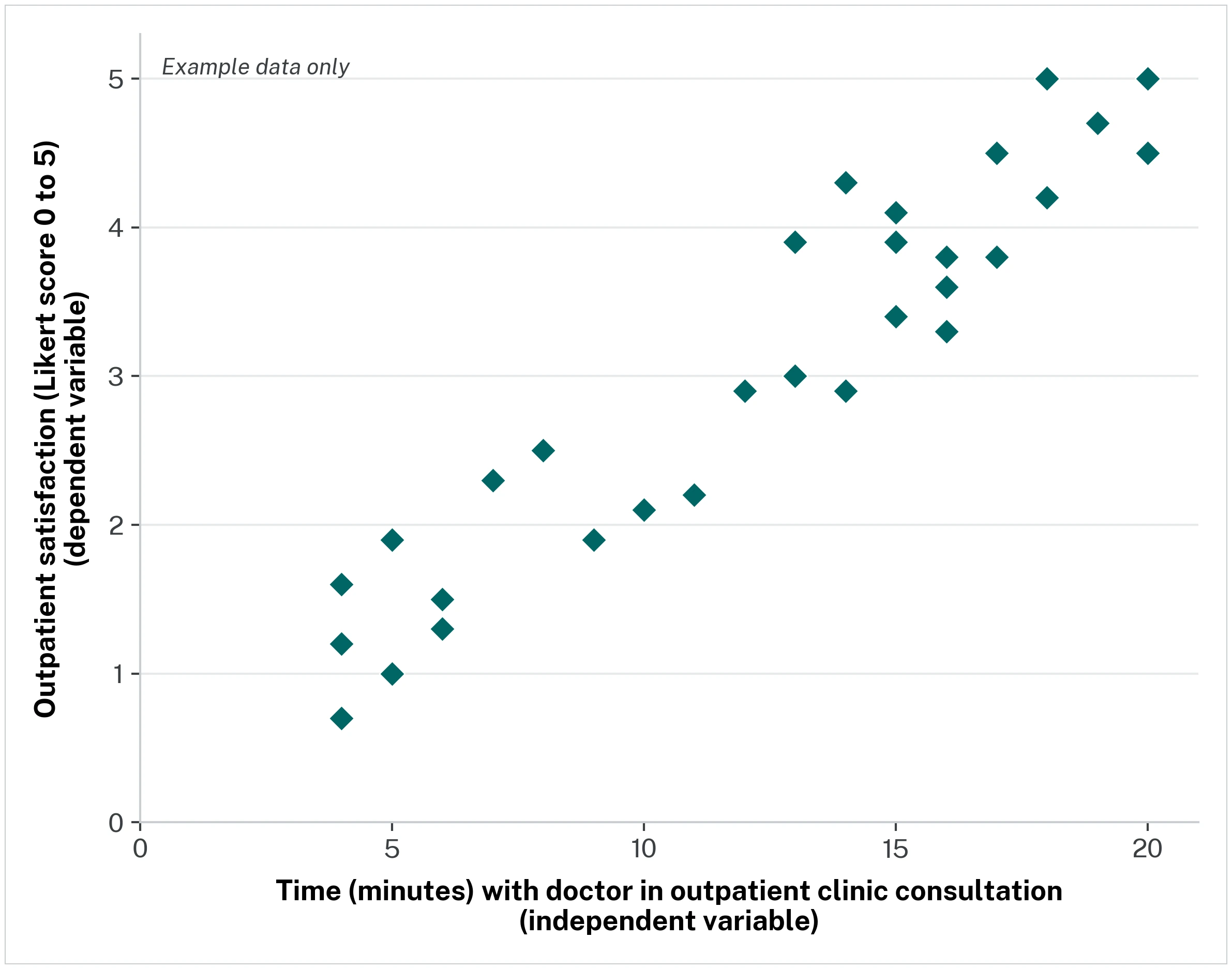
Is there a relationship between the length of an outpatient consultation and a patient's satisfaction score? Plot consultation length on the horizontal axis and satisfaction on the vertical axis. The closer the points cluster in a line, the stronger the relationship.